Hi everyone,
I’m currently trying to use the <Tag /> component from Atlaskit in our app, which is built with Custom UI.
Here’s the documentation for reference: ADS: Tag component
Unfortunately, I’m running into an issue: the background color is not applied correctly.
Expected result:

Actual result:

When I try to use the color property, it doesn’t work as expected either:
Expected result with color prop:

Actual result:

Here’s the code I’m using:
return (
  <Tag text="red Tag" color="red" />
);
Has anyone else encountered this issue, or is there something I’m missing?
Thanks in advance!
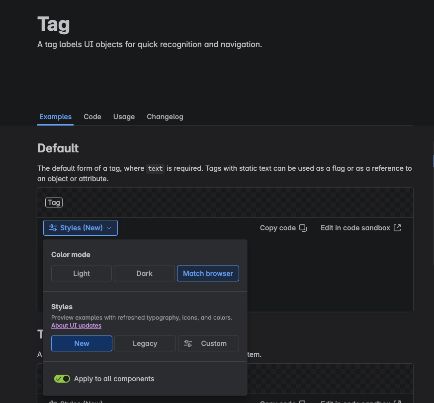
Hi @EtienneLarroumets , Atlassian is currently rolling out a visual design refresh across ADS components. The actual result you’re seeing is the new design of the Tag component. The docs are currently showing the legacy design by default, but you can toggle on the new design to see those in the docs as well:
All Tag components currently used in Atlassian products will eventually switch over to this new design so we recommend leaving it as is in your custom UI app. This way your app UI will also align with the product UI that it’s running in.
If you still prefer the filled-in style, the Lozenge component with isBold has a similar look to the legacy Tag: https://atlassian.design/components/lozenge/examples