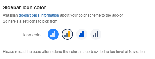
@dmitry.astapkovich you can simply use two different color variations for your icon, one for the system-level sidebar web item or general page and one for the project-level sidebar web item or project page. That would address the issue as you’ve described in your screenshots.
I recognize that this would not necessarily solve the issue for customers who customized the look and feel of Jira; we’re aware of this issue but it’s not a top priority for us to address at this time.
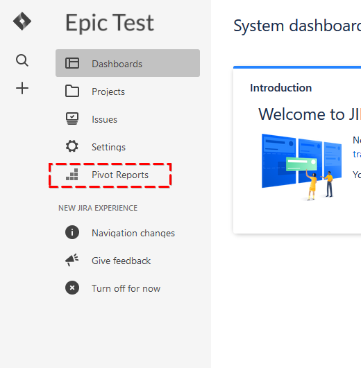
Hmm, this is not even close to a solution to be honest. The example I’ve shown here is taken from two different instances of Jira. One is default, another one (the white) is customized.
The new cool shiny Jira UI has very limited customization options, and even they are not supported properly. And this makes the products, both Jira and add-ons, looks cheap. Btw, those who make it to the top menu, a typically most used and expensive ones, like Tempo.
Those are just SVG icons. You need to color them in just the way you with other icons in the sidebar with pure CSS. I understand the priority thing, but this is obvious bug in the very foundation of the new UI.
I actually had customers complaining that they can’t access installed add-on. It turned out they had white background and collapsed sidebar, which rendered my icons totally invisible