I’m thrilled to announce that we’re rolling out a brand new design for our API reference pages, starting with the Jira Cloud and Confluence Cloud REST API reference pages.
Along with a new design, we’ve introduced a new three column layout to enable developers to see the content and corresponding code snippets side by side.
Much as I like the more structured approach to the layout, I just can’t abide by sites that force their content into a narrow central column which doesn’t expanded to fill the available space.
If there’s plenty of available space on the page, why waste it?
I agree with @anon96974232 that the page should be responsive and allow wide-screen monitors to benefit from their real estate. Especially when reading docs, having more space makes it easier to parse the page. It becomes very very crowded with this limited viewport.
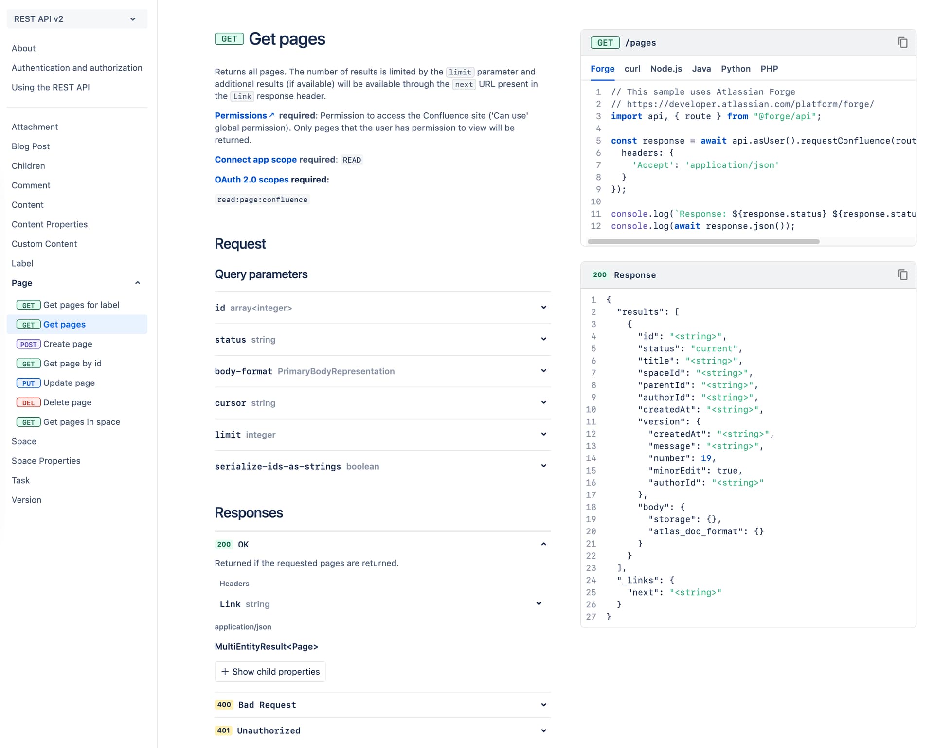
The coloured http method labels on the sidebar menu are distracting. I don’t care about the HTTP method when navigating to the endpoint
The “response” box is confusing. It changes based on the selected response in the main content, but it it positioned directly below the example code box so it does not seem related as it does not directly align with that section in the main content. It also looks similar to the example code which has a tabbed selection, but in this case selection in done through the main content.
The child properties pane is… something. With large response objects, navigation is going to be dreadful, especially because it opens a window after 3rd nested level? Can’t just just give us real code? As in Typescript types for NodeJS/Forge, Interface class for Java, etc?
FWIW, while I understand what Remie means in terms of visual noise vs. utility and would never have asked for those labels, my eyesight is deteriorating and I noticed that I can parse the sidebar much quicker now, i.e. seeing the colored HTTP method label helps me quickly scope down to what I’m looking for without reading every line in detail - so the usual tradeoffs and personal preferences I guess …
Relatedly, I particularly like the tiny suffix icons to mark experimental and deprecated methods that ease filtering resp. scopes right away, quite neat and helpful!
I’d also prefer to have a code based schema available, but understand the docs vs. code problem - maybe adding tabs to the example response box to the right would be a compromise to allow for language specific and easy to copy schema variations, similar to the example request box?
Hi all. Here are two other issues with the new REST API viewer:
It hides the OpenAPI link. This used to be visible in the “…” at the top right of the page, but I can’t figure out where it went without going back to the classic view. This link should be made available somewhere obvious for all API sets. (Perhaps this could satisfy @sopel’s concern, although it would be nicer to have the full response type available inline as code from the web page, without having to dig into the API spec.)
For the two versions of the Confluence APIs, it defaults to showing v1 in the dropdown. The dropdown to select v2 is not particularly obvious unless you know it’s there. The default should probably be v2 (assuming that this is the future), with appropriately-highlighted sections above the fold, at the top of both the v1 and v2 APIs, pointing to the existence of the other version of the API.
–
Edit: I see that the OpenAPI link is in fact available, but you have to click on one of the top-level API group sections (rather than just expanding the section) in order to see the link. The link is therefore not visible if you click on the “About” page at the top, or even if you click directly on an individual API call, so something is not showing up in the right place.
Thank you Scott, Remie and everyone else for your detailed feedback on this thread.
Some of items mentioned here (coloured labels on sidebar) generated mixed opinions during user testing, so we are grateful for your opinion on that. By far, the biggest feedback is regarding the width that’s unused on larger screen monitors. We are trying to find a balance between that vs maintaining a width that’s comfortable to scan for most users. Poor usability and scannability of the docs was the biggest complaint with the earlier design.
I always have somewhat mixed feelings about this. Because I don’t think you can create a design that will actually solve that problem (as proven by the comments). There are too many variables, to many personal preferences.
Personally, I have gotten used to the old design in a way that I can navigate everything. The new design solves some issues, but also creates new ones (like with any redesign). So it’s a net neutral change for me. The only downside is that now I need to become familiar with the new design
The POST API request parameters seem to be broken a bit, e.g. “Create Filter” lists favouritedCount as part of the request body. I’m pretty sure I cannot pass the favouritedCount in the request body, or how would Jira distribute these favorites among the users? The same seems to be true for the “Create issue” screenshot that Remie posted, it seems that the “request body” parameters get mixed up with the “response body” somehow.