Let me try again. Unfortunately, you have closed RFC-3 so I will start a new thread here.
Remember that time when you reverted the new Marketplace vendor reporting section because we blasted you for the poor usability / accessibility? It’s really great how you listened to our feedback and decided to just go ahead and re-launch it again.
We told you not to use Red/Green in the graphs because of accessibility. You did it anyway:
We warned you not to partially redo the reporting pages because A) atlaskit/DS components sucks (which is well documented) and B) because you’d likely make it worse. You did it anyway:
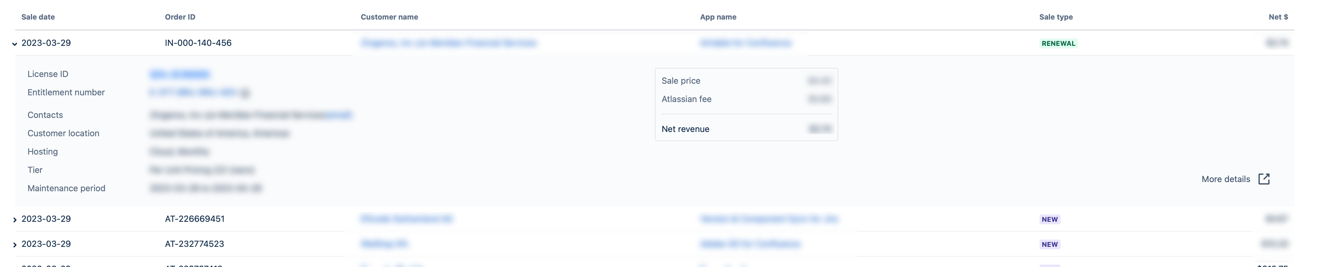
Do you honestly think this is good UX/UI? Have you even tried looking at these pages on a larger monitor? Do you think it makes sense to put the “More details” button in the bottom-right corner and the nested sub-table of revenue on the 50% marker of the table width of the expanded row? Is there a reason why I have to bend my neck to get Net $? The Table Tree component is not usable in a responsive setting. Also love the fact that the page navigation and vendor name/logo on top is still center-aligned.
Are you even trying to make a product that is usable for your customers (read: Marketplace Partners)?
PS: please also spare me the “we are upgrading our stack” BS. I don’t care about your stack, I only care about the end result.
I’m at a loss of what to say. You’ve made the charts unusable for me. I have red/green color blindness. Your previous version was unusable - you were told. There are several emulators out there that will show you what folks that have color blindess sees so you could easily verify what they saw.
The tables are themselves are unusable for so many reasons. - click to expand for example.
Just sad…
I would say that you should not roll this out - but you’ve already started so there’s nothing else to say since it will just get ignored.
This is very disappointing. Atlassian has been making great effort with accessibility in its products over the past year or more. That includes color vision disabilities (8% or more of men). This work seems to just give up! What happened?
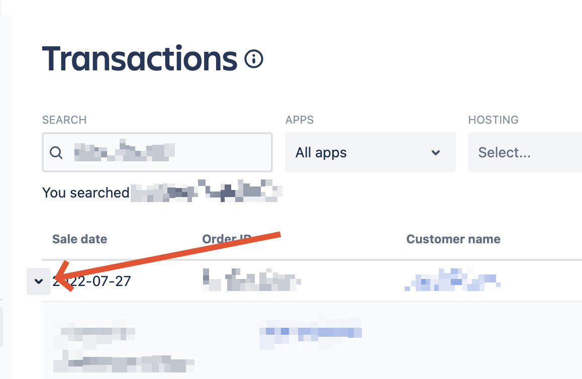
Making this tiny button the ONLY trigger to expand/collapse the row is a crime. It was the whole row since the beginning of the times. And a mistake like that screams out loud the developers haven’t use this interface for a single day. Shame.
In fairness, whether or not the display is readable isn’t one of the aims in the RFC:
The implementation of the “Atlassian Design System” to ensure uniformity and consistency in all the marketplace touch points.
Enhanced analytics and instrumentation capabilities to facilitate faster learning and the creation of tailored user experiences.
Additionally, improvement in the overall performance and page loading speed.
Personally, I find that information I could see quickly in the old version, I’m unable to see at all in the new version. I know it’s the same information, but the way it’s presented doesn’t work with my brain. Though, maybe I’m just too old for this and should retire.
Additionally, improvement in the overall performance and page loading speed.
But they failed this as well right? I mean, if you go to the Sales chart and click on one of the app names in the table, all components (incl. the table) will reload and the page will jump.
If you compare this to the old experience, the graph & table are greyed out and a loader is shown.
Both the actual and preceived performance and load of the old experience is better compared to refreshing the entire section.
Here is an example video to show what I mean. I used our first sales in 2012 because I don’t want to spent time on obfuscating details
set default grouping to months instead of weeks and save date ranges
see Cloud instance user count in the license without switching to transactions
have a separate and clearly visible button to open transactions from the license
I can continue, but who cares? I guess the idea is to make an impression you are delivering something instead of delivering what is actually needed.
So again, the question is same as before: what EXACTLY was the goal(s) of these “improvements”? Where and how did you collect your “insights” about the “problems” we as vendors have with this UI? Though I know there will be no straight answer as always.
Thank you for your feedback. We know improved reporting capabilities are a high priority for you and your business. As we touched on in the RFC, we’re on a multi-stage journey to completely rebuild Marketplace reporting so that we can both deliver the experience you expect today, and move faster in bringing you new reporting and BI experiences in the future. This journey began when we replaced the data pipeline for reporting. This is the second stage of the journey: replacing our tech stack so that we can move faster to bring you new reporting options in the future.
We recognise that in our haste to replace the reporting tech stack, we released the new experience before we were able to fully address your feedback from the RFC. Our goal here was to do a soft-launch of the new experience to a subset of partners with an option to revert back as the team continue to work on improved capabilities rather than waiting for one larger launch to de-risk future launches. We needed to be more clear about this and about what was work-in-progress. The ‘Old experience’ link in the left menu will switch you back to the previous UI. User experience is very important to us, and we’re sorry to have led you to believe otherwise or not given more context on the changes when they were released.
Please rest assured that we plan to address the feedback you’ve called out (see below) in the coming month or two.
Accessibility compliant colours in charts - Ensuring accessibility is very important to us. We acknowledge that we missed the mark with this in the initial UI and plan to roll out an update to address chart accessibility in April or May at the latest.
Transactions expand / collapse row behaviour - This is an Atlaskit limitation. The team is working on a fix and we expect to have this resolved by end of April.
Optimising UI for large screens - We are currently working on this and expect to have this rolled out in April.
We will let you know when the changes are made so you can check and let us know your thoughts.
Some of the feedback received is specific to mobile experiences. Right now, 80% of reports usage is being done on the desktop experience which is why we elected to optimize for this experience first. We recognise that always prioritising desktop over mobile could be influencing the usage in this direction but we did have to make some tough trade-offs and felt it was best to follow usage trends at this time.
Thank you again for the feedback. We are fully committed to improving our platform and providing you a desirable experience. We value your inputs and appreciate your continued support.
To be honest, I’m not buying it. The Atlassian Marketplace team needs to do better than this. In the context of the open company, no bullshit, I am imploring you to be more open to the constraints the Atlassian Marketplace team is facing (internal or external) that are causing you to deliver sub-optimal results.
If you are getting pressure from us, Marketplace Partners, or internally from within the Atlassian organisation, please let us know. If you have unrealistic OKR’s, please let us know. If this is not possible in the open, I’m happy to chat privately. Allow me to put pressure on the right parts of the organisation to help Atlassian improve. Because frankly, this just isn’t good enough. And it’s also not good enough with regards to the standards Atlassian pretends to hold itself accountable to.
Yes, you told us about the soft launch, but even after you were asked by me and @boris you failed to tell us anything about the proces of collecting & processing feedback.
Even if you truly do care about the feedback you are getting from you customers, mind you, the Atlassian Marketplace team does not appear to actually listen to it. Or at least, that is not how it is perceived.
Regardless of whatever we tell you, you appear determined to continue on the path you have chosen. So please, instead of empty promises, can you come back with either a reference to the person up in the chain that is forcing you to deliver half-baked products to your customers so that I can scream at them, or, if this is all by your own making, a decent plan on how you are going to restore the faith of your customers.
Everything @remie said but with a notch up on the frustration level. I feel that the delivery of this is a huge middle finger to the marketplace vendors. Atlassian had initial feedback that they basically threw away (and even in now ignore to mention).
I did not expect to live the day that @danielwester was more angry about something Atlassian than me Is this what the apocalypse looks like? Should I be on the lookout for the four horsemen?